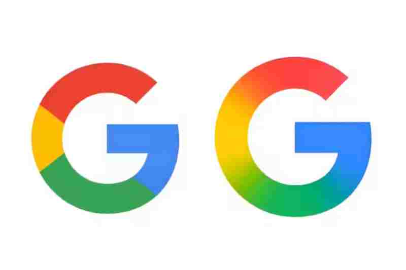
Google Redesigns the Iconic “G” Logo for the First Time Since 2015

Google has released a revised version of its iconic “G” logo, the first significant graphic upgrade in almost a decade, in a slight but significant change. Instead of using the conventional segmented color format, the revised design uses a smooth, multicolored gradient that seamlessly combines Google’s iconic red, yellow, green, and blue colors into a swirl.
This elegant appearance is similar to the style used in the most recent branding for Google’s AI products, such as Gemini and the AI Mode in Search. The gradient design is a reflection of the company’s larger effort to create a cohesive and contemporary visual identity for all of its services.
Through the beta release of version 16.18 of the Google app, the new logo has started to show up on Android smartphones and is now being distributed to iOS users through the Google Search app. Even if the change is minor, especially for smaller sizes, it represents a larger change in the tech giant’s design language as it becomes more in line with its AI-first strategy.
This is the first significant alteration to Google’s logo since the tech giant unveiled a more contemporary six-letter wordmark and a flatter, sans-serif design in September 2015. The now-familiar freestanding “G” made consisting of four different color segments was also added in that version.
Google’s approach to visual progression is consistent with this upgrade, which comes over ten years after the last logo redesign, much like the redesign of the Google Play logo on its tenth anniversary.